Daniel Bradley
Forest Fire
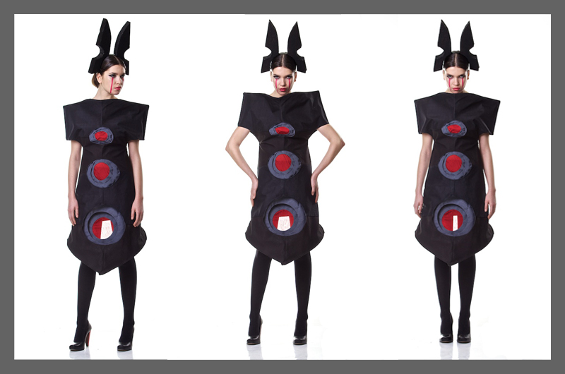
Instead of looking toward the flowers of the Cape floral kingdom for inspiration I leant toward something slightly different. As we are upcycling clothes to construct our new garments through deconstruction I asked myself what symbolizes rebirth in the Cape floral kingdom. I used the summer fires we have on the mountains as my inspiration as once they are put out; plant growth has to begin again. The colours I chose are black, charcoal & red which all signify the colours in a fire.
BEFORE:
AFTER:
Amy Holland
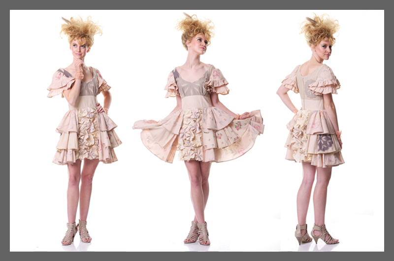
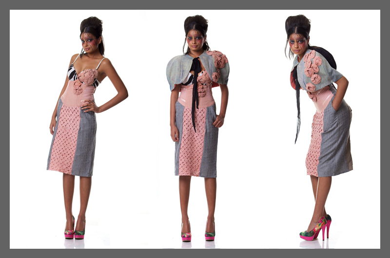
I wanted my design to be edgy and fun but with a classic twist so designed a mid-length dress and a cape. It was constructed using an old bra, two old tops, two pairs of jeans, a dress and a shirt. I decided to take inspiration from very specific flowers in the Cape Floral Kingdom and incorporate their details into my designs. The panel of lattice hand smocking is inspired by the pattern created by the leaves on the stem of the protea, the diagonal lying pintucks on the side panels of the dress were inspired by the Erica flowers and the way they diverge from each other into opposite directions, I placed the fabric yoyo’s on the bust and shoulder to symbolise the clusters of flowers and the roundness that they create in the eucalyptus bush, the ball-shaped accordion on the back of the cape was inspired by the pincushion protea.
BEFORE:
AFTER:
Skye Kerr
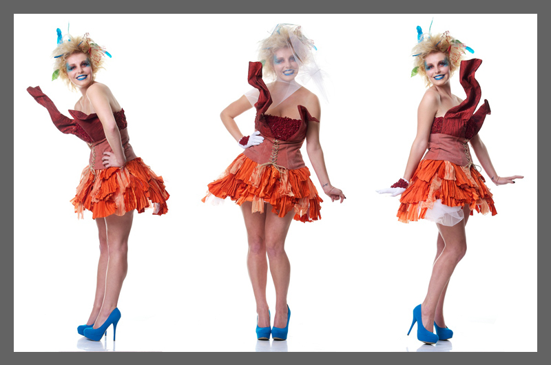
My inspiration behind my Avant Garde outfit for liveeco comes from the beautiful poppy flower of the Cape Floral Kingdom, as the colours inspired me to incorporate red and different shades of orange. The pleated pieces on the skirt mimic the petals of the poppy flower; the silhouette being inspired by the shape of the flower. The fabric manipulation on the bodice represents the lovely roses of the cape floral kingdom. The woman who wears this dress is a strong, powerful, beautiful and rules over the Cape Floral Kingdom. She protects the Cape Floral Kingdom.
BEFORE:
AFTER:
Kayleigh Lemoine
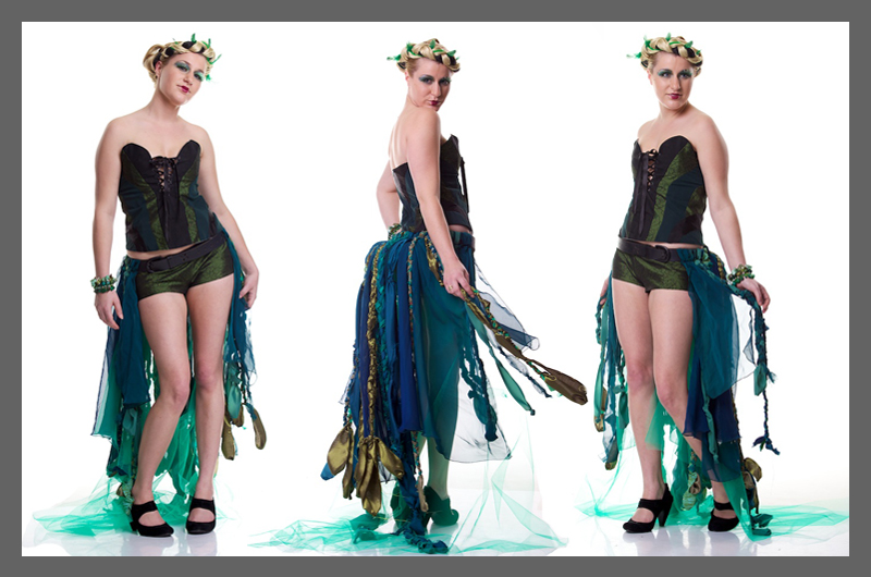
The inspiration for my Avant Garde outfit is MOSS. I wanted to take a simple concept and expand and exaggerate it. I love the way it drapes over, hangs off, lives on top of, anything it comes across. Whether it´s at ground level or growing on swaying branches of trees in forests, it can have stillness or movement which was an idea I enjoyed experimenting with. There are over 10 000 types of moss, with a variety of shades and hues which directly influenced the fabric manipulation of the train in my outfit. I explored this idea by intertwining fabrics with various textures and earthy colours.
My corset incorporates different shaped panels that curve around the body much like moss spreading over a rock. It was thrilling to capture in garment form the imagery of these beautiful, alive and thriving plants.
BEFORE:
AFTER:
Elizabeth Mbulawa
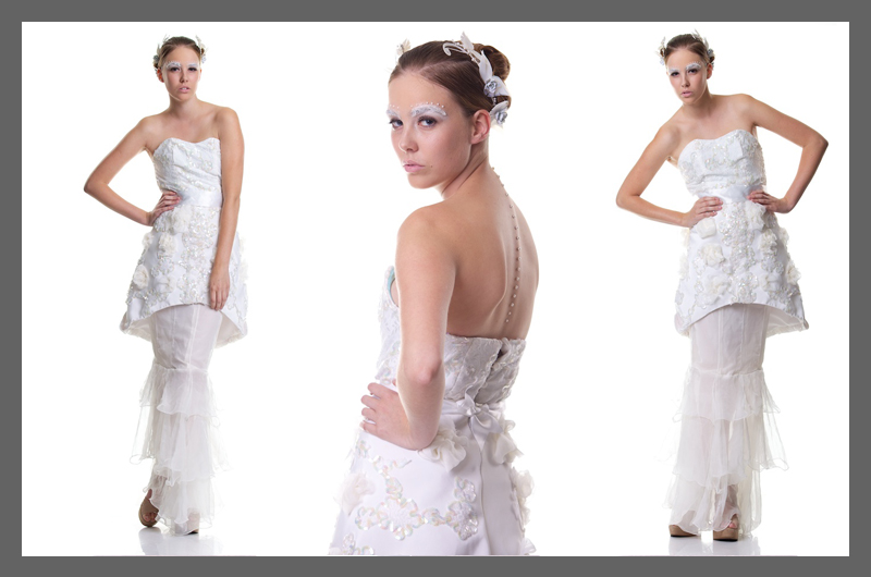
The brief was to use unwanted clothes to create something upcycled and Avant Garde, to educate and sell the idea of eco conscious living in our design. I was inspired by the Arum lily colours and silhouette. I wanted to create something beautiful. The White Arum lily is a symbol of purity, virtue, chastity, friendship, devotion and is used for bridal bouquets, and white symbolises marriage, truth, peace and purity. With these connotations and the task of instilling an element of eco consciousness into our design skills and educating South Africans on eco chic living I felt a wedding dress best suited this concept. My Avant Garde wedding dress, is all white, I tried to create a silhouette of lily overlay shape, which has the fabric manipulation made of silky chiffon and applique of french chantilly lace. Trends I have incorporated in my design is lace, for bridal trends I have used is ruffles, flower fantasy, two tiers trend (creating skirts with two distinct tiers, exaggerated form of the peplum).
Fortunately I was donated an old wedding dress from the 80’s therefore the colours of my concept changed. I no longer wanted the yellow and green I wanted the dress all in white, to remain true to the idea of
a wedding dress. Besides the white arum lily is a symbol of purity and is used for bridal bouquets, and white symbolises marriage truth peace and purity.
Deconstruction of the bodice – I got the turquoise bodice from the liveeco clothing drop and from the wedding dress creating a new heart shape bodice. The bodice is made from French chantilly lace and silky chiffon.
BEFORE:
AFTER:
Callen Petersen
ACTIVE DEFENCE
The Cape flora is ecologically very delicately balaced. Alien species readily become established in fynbos, and displace the native plants and animals. As a result of this, combined with the naturally limited range of many species, urbanization and the spread of agriculture, numerous fynbos plants are now seriously endangered or extinct.
The major threat to fynbos is the spread of alien plants (such as hakea, rooikrans, port Jackson and pine trees).
This range is inspired by 2 factors:
- The ecological threats experienced by the indigenous plant life in the Cape Floral Kingdom.
- Various ways in which we can ensure thee threats are controlled and/or eliminated.
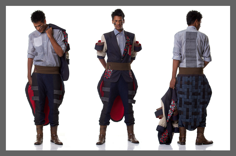
I focused on the current MILITARY MOVEMENT trend, as it emphasized the battle the public has to undergo to ensure the safety and longevity of the indigenous plant life. In essence, fighting a battle that they themselves cannot do alone. The outfit has a strong military feel – accomplished by the usage of layers and strong, structural silhouettes.
The manipulation and upcycling is very symbolic:
Shirt
Made from many school shirts. Symbolism of the education needed in this matter. The pocket manipulation is symbolic of the many different species all living together in one environment, coupled with the black thread (symbolic of threats that live with the plantation). The back features a waved pintucked manipulation taken from a shirt from the Durban July earlier this year.
Pants
Made from denim skirts. It features 4 “bumps” that look constraining. This is symbolic of the 4 main alien species that prey on the indigenous species.
Belt
Features a tailcoat made from weaved denim strips from jeans. This is, once again, symbolic of the many species all entertwined and living together, including the threats.
Jacket
Basic bodice of the jacket is from a school blazer. Once again, the theme of education comes through. The sleeves are made out of khaki pants and feature more constraining hoops, made from more pants and the blazer sleeves themselves. It also features many buttons, once again symbolic of the mass culture in the floral kingdom.
This outfit is a strong male-influenced silhouette, following a current trend, using carefully selected upcycled garments with very specific features.
BEFORE:
AFTER:
Thandi Pritchard
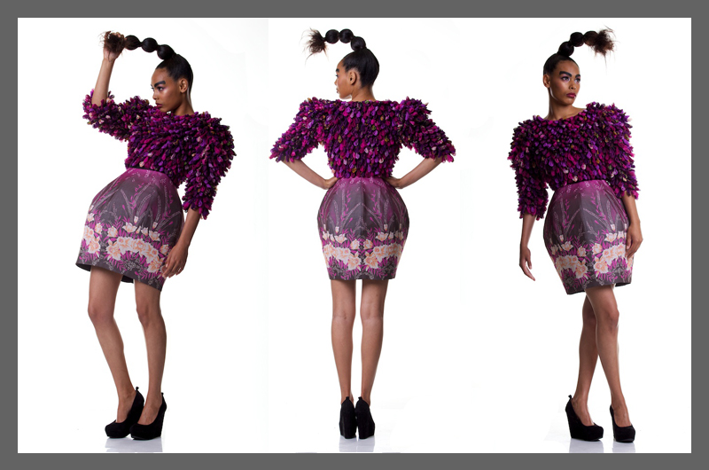
The inspiration for this design came from the Erica flower, one of the most beautiful flowers in the Cape Floral Kingdom. I love the shapes and colours of the different species. I was especially drawn to the bulbous ones in shades of pink and purple. I chose a range of colours reflective of the Erica flowers. The shape of the blossoms on the bodice and the silhouette of the skirt replicate the shape of the flower. I have used second hand saris for all the blossoms and the skirt. I made the blossoms using a Japanese technique known as tsumami. I used the border of one of the saris to create a floral border on the skirt. The bodice was made from a black shirt. I lined the dress with a black sheet. It is eco-friendly because I used natural fabrics: silk saris and cotton shirt and sheet. I didn’t have to dye any of the fabric as I was happy with the colours. I didn’t have to buy lining. I only bought buckram and fusing.
BEFORE:
AFTER:
Brittany Stroebel
The inspiration for my Avant Garde fabric manipulation outfit came from the Protea Nerfolia, more commonly known as the Bearded Sugar Bush. The first thing that caught my attention was the beautiful deep pi
nk colour of the flower, the second was the interesting black fringe of fur around the petals that you could only distinguish once looking at the flower close up. I also recognised it from many school outings investigating Fynbos!
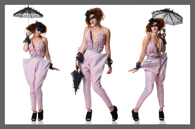
The part of the flower I focused on for my garment was the shape of the petals and the colour. I didn’t realise this colour would be so difficult to achieve. I mimicked the pointed oval shape in the panels of my pants, creating an Avant Garde silhouette. I choose my fabric manipulation technique because of the organic natural way it comes together, just like nature and because of the ruffled, messy look of the black fringe on the petals.
BEFORE:
AFTER:
Andreia Moniz
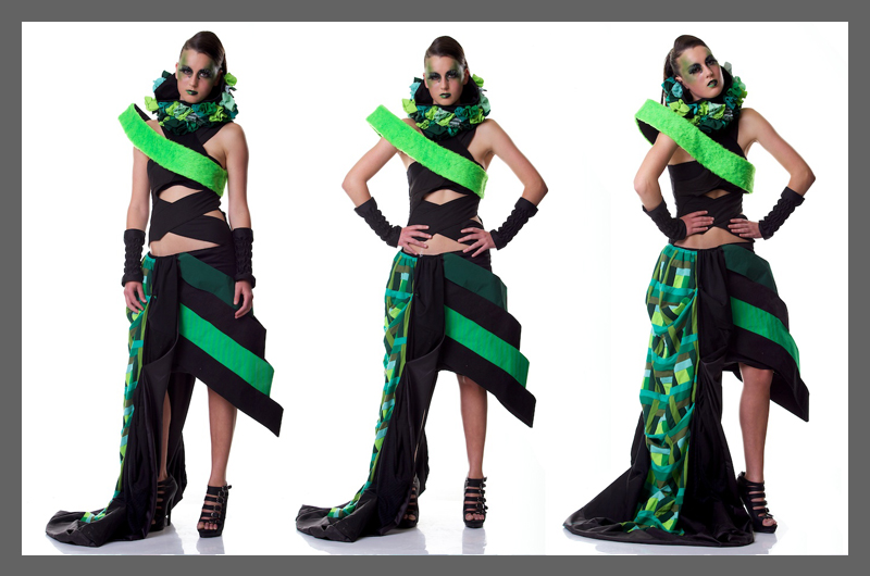
My chosen plant of inspiration was the Cape Ivy. Considering the fact that this is a very domineering plant that grows everywhere, my outfit had to be strong and almost overpowering. In collaboration with the Cape Ivy plant I decided to use a female villain as further inspiration and subsequently chose Poison Ivy.
The fabric manipulation that I used –
- log cabin quilting
- ruffle puffs
- machine elastication
The colour palette that I went for is different shades of green and black. Green represents the plant and the black represents the domination of the plant.
BEFORE:
AFTER:
Zoe Gee
Trying to guess what materials would be available was challenging. Being experienced with working with denim from this year´s SA fashion week competition, I had scraps of denim jeans so I decided to use that. I didn´t have enough denim to make the skirts, so my mom´s curtains and cushions caught my eye!
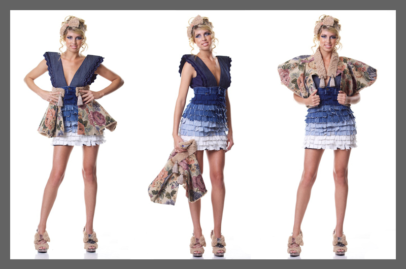
The plant I chose was the cotton wool type fynbos found in Hermanus in the Western Cape. This furry species matched perfectly with the fur cushions. I wanted a ragged yet sophisticated look so cutting strips of denim and placing them in rows of various colours gave a different illusion – one of puffiness yet a modern stroke. I also made a wrap skirt from the curtaining and fur cushions and also used it as a cape. Two looks with one piece.
BEFORE:
AFTER:
Tamara Dyson
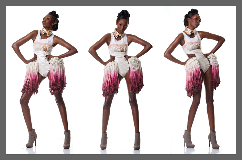
I decided to focus on The Protea as my inspiration for my design concept. I researched into the many various species of the protea flower, each having their own defining characteristics. I was incredibly intrigued by its contrasting elements of structure and strength, and ethereal magical beauty. The ombre, almost dip-dyed colouring, is what initially drew me towards this breathtakingly beautiful indigenous flower.
My main concern was to show my design style through my idea, and not merely recreate something that had been done before; as well as not simply deconstruct a dress, and then remake yet another dress.
I put an incredible amount of time into perfecting my pattern, with it needing to fit exactly due to the fact of it being non-stretch. I considered all the design elements in such a way to create a perfectly balanced and structured outfit. Silhouette and line were very important aspects when conceptualizing my design.
I developed on the concept of underwear and outerwear, creating a bodysuit that enhances one’s natural curves and beauty, as well as making a bold statement by emphasizing the lines of the figure by using corsetry lines and binding.
I recycled shirts, knitwear, an old calico-mock-up, sponge, mops, buttons, as well as a kitsch 90’s pleather jacket. I made use of organic veg-leather offcuts to construct an oversized clutch bag. All aspects of the design that were dyed were done so by using eco-friendly products such as cooked beetroot, wine, turmeric, saffron, coffee, tea, rhubarb, lemon juice and mud, as well as making use of pieces of old copper and rusty nails to enhance and adjust colours.
BEFORE:
AFTER:
Valerie Britz
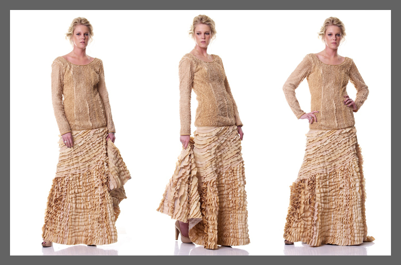
The main aim of this creation was to capture the way in which the senses are enticed by the Cape Floral Kingdom.
The movement of the garment expresses the way in which the flowers and shrubs move in the fresh ocean breeze, which can so frequently turn into a furious gust of wind, and more often than not, into a stormy wind! I tried to imagine how I could convey the distinct Fynbos fragrances in shape, and colour, and decided that the flowing movement of the dress would be the best way to express this. There is also a certain sense of playfulness, joy and youthfulness in this dress, which is the way one tends to feel whenever in the presence of mother nature. In an effort to express my respect for all things natural, and to create the desired colour, I used tea as a natural dye. The washed out colours of the well used duvet covers, continental pillow case appealed to me, as I immediately knew that I can create something aesthetically pleasing with discarded items
The myriad of floral species found on the mountains, plains, and dunes of this area appeals to the senses in so many ways, and it was a challenge to express this in a garment.
TO ENTER:
Fill out the entry form below and select your favourite designer from the drop down menu.
Tweet this competition for an extra entry. Just be sure to @liveeco_za so we know you tweeted.
Competition Rules:
*Competition ends 19 November 2011
*Open to SA entrants only
*One entry per email address
*The judges decision is final
*Entrants must supply full name and contact details along with their submissions.
*Winner will be chosen at random.
*If winner cannot be contacted, the prizes will be reassigned.
*liveeco reserves the right to forward entrants´ details to competition sponsors.
*Competition prize not transferable and no cash alternatives are allowed.
*Prize value subject to change according to stock available
*By entering this competition, you agree to receive correspondence from liveeco and affiliated competition sponsors.

